

Setting the foundations
StubHub brings the joy of live to fans globally. StubHub is the world's largest ticket marketplace, selling 100,000+ tickets per day, with tickets available for more than 10 million live sports, music and theater events in more than 40 countries.
Our goal was to create a scalable system of components, patterns, color and code for StubHub’s web and native products, enabling designers and developers to focus on product-level problems and ship high quality work efficiently and consistently.
The grid
The goal was to create a single set of breakpoints and grids to implement as each product team moved into the new React framework.
Based on best practices, research, engineering and designer interviews, testing, and iterating, these insights emerged: (1) designers needed a tangible, logical grid with a base that closely matched the grid, and (2) developers understood the grid more abstractly, with percentages, flexible columns, and gutters.
After iterating and reviewing with the team, we landed on a flexible column width and fixed gutter grid with a 4 px base that balanced ease-of-use for designers and developers.

Color palette
The color palette needed to keep the spirit of the marketing colors while creating a scalable, accessible color system for the product that (1) works in any situation with no disruptive changes, (2) uses SASS variables for designers and developers to communicate, (3) enables fast product-wide changes, and (4) reduce inconsistencies in the color palette (from 200 shades of gray to a few).
Partnering with the marketing and product teams, I played off of the vibrant Brand palette to produce a digital palette that was acceptable to both marketing and product design teams. Through multiple iterations, design team feedback, and brand refreshes, I developed a scalable, concisely-named color palette with a reduced number of neutrals and accent colors to provide an accessible UI scaffolding and a clear structure for designers and developers.

Color ramps helped to create a scalable, themeable palette

Color explorations incorporating the new palette into the event page
Typography
The typography scale needed to be optimized to serve existing styles while enabling (1) a consistent brand personality, (2) ease of use for designers and developers, (3) fast, product-wide changes, and (4) increased performance.
After researching other approaches to typography systems, I audited key screens across the product, reduced and consolidated similar styles, organized a visual hierarchy, and named the core typographic styles (font, weight, line-height, and color) with Mixins.
The next steps of the process included stress-testing and iterating on the visual hierarchy in-product, then pairing with a few designers to test the new system across the work they were doing.
Page performance was a critical goal, so we changed the font family to Helvetica, which reduced page load time by approximately three seconds.
The rationale was that when (1) the product had moved to React, (2) Mixins had replaced the unique font and styling code, (2) and page performance was optimized; the team could consider a more brand-specific font family.
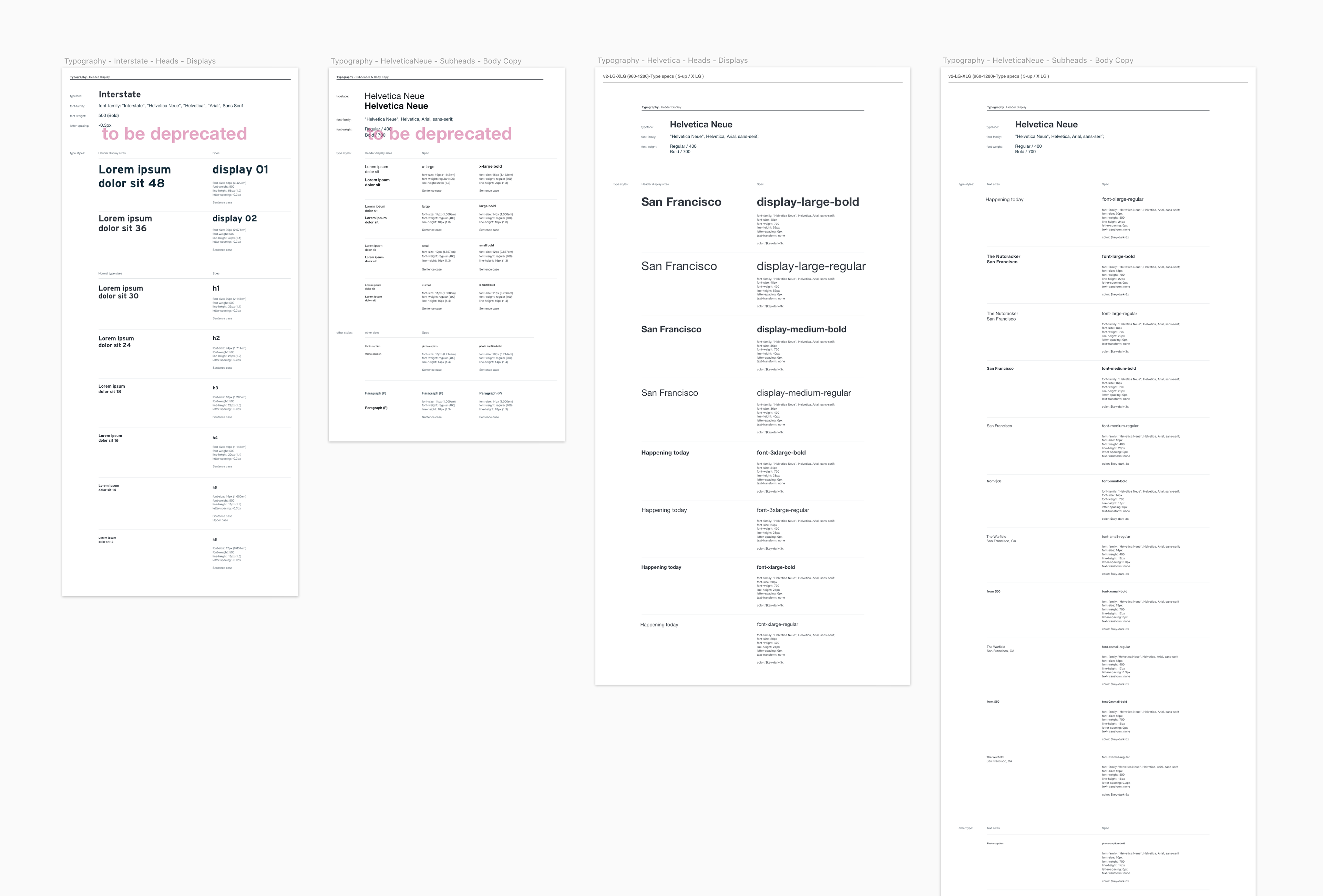
Typography scale iterations and deprecated font family

Typography scale in use on the home screen
From foundations to components and patterns
Below is a gif of the first version of the design system, with the foundations, existing components, and patterns.